The article layout is structured using a fine modular grid of 11 × 6, inspired by Josef Müller-Brockmann’s principles outlined in Grid Systems. This grid provides flexibility while maintaining clarity, allowing for comfortable reading and consistent alignment across articles that contain large amounts of body text. The modular system supports variation in image placement and text hierarchy while maintaining overall unity throughout the magazine.
For typography, I chose to use single type family: ITC Franklin Gothic LT. Different weights within the family as Book, Medium, Demi, and Heavy. They establish a clear hierarchy across the article layout. This approach ensures visual consistency while allowing contrast between headlines, subheadings, and body text. The choice of one type family supports readability and reinforces a clean, modern editorial aesthetic.
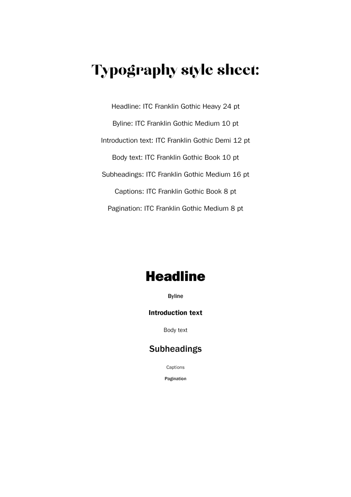
I have created this clear typographic hierarchy which is a variation within a single type family, which can enhance readability, consistency, and visual unity across the article layout.
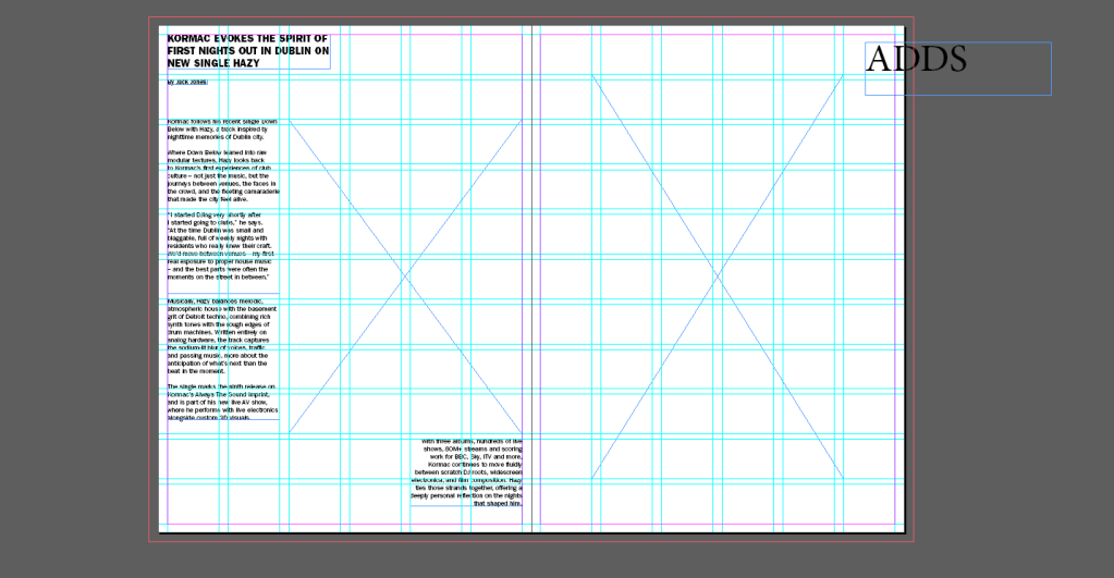
Using the defined grid system and typography style sheet, I created a first rough draft of the article layout. This draft is a rough ”sketch” on testing text flow, hierarchy, and image placement. Want to create a pleasant white space, with great images, illustrations, commercial adds of events (just like in old magazines of i-D), but not overdoing it, but creating a comfortable view for a reader.

Leave a comment