Coming back from Summer vacation and diving back into studies! Been a while since last post and happy to get back to it and to make my brain have a twist while also waiting for Fall to come!
My task today that I will share is a deconstruction of an existing page. I have had to pick one from a newspaper, magazine, and book. Unfortunately, I am not receiving any newspapers, so I picked two magazines for this task.
Design is Storytelling. Book

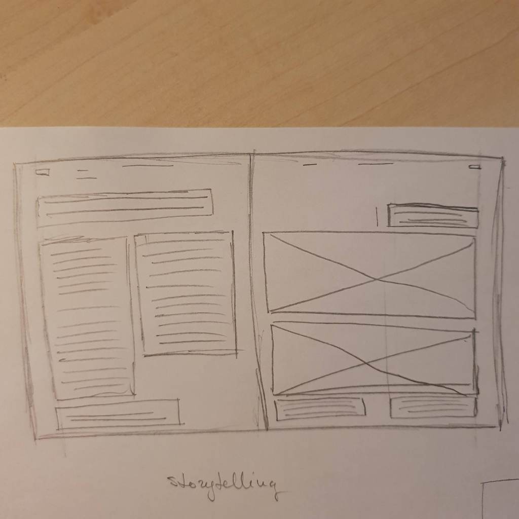
I chose this book as an example because I like it’s design and layout, the information is given very clearly, clean layout gives great opportunity to memorize the information. Column widths go from 6.8 to 6.2 cm wide, the main text columns are 6.8cm. The left and right margins are 1.1cm, top one 0.7 and bottom one is 1.9cm.
I feel that this is a modular grid but I have some feeling of similarity with the baseline grid too. Texts sit on line and seem like aligning with images. Between these two pages, remain the same margins, the pages are organized and clean, columns remain the same and symmetrical for the eye.
Beata’s Kitchen. Magazine

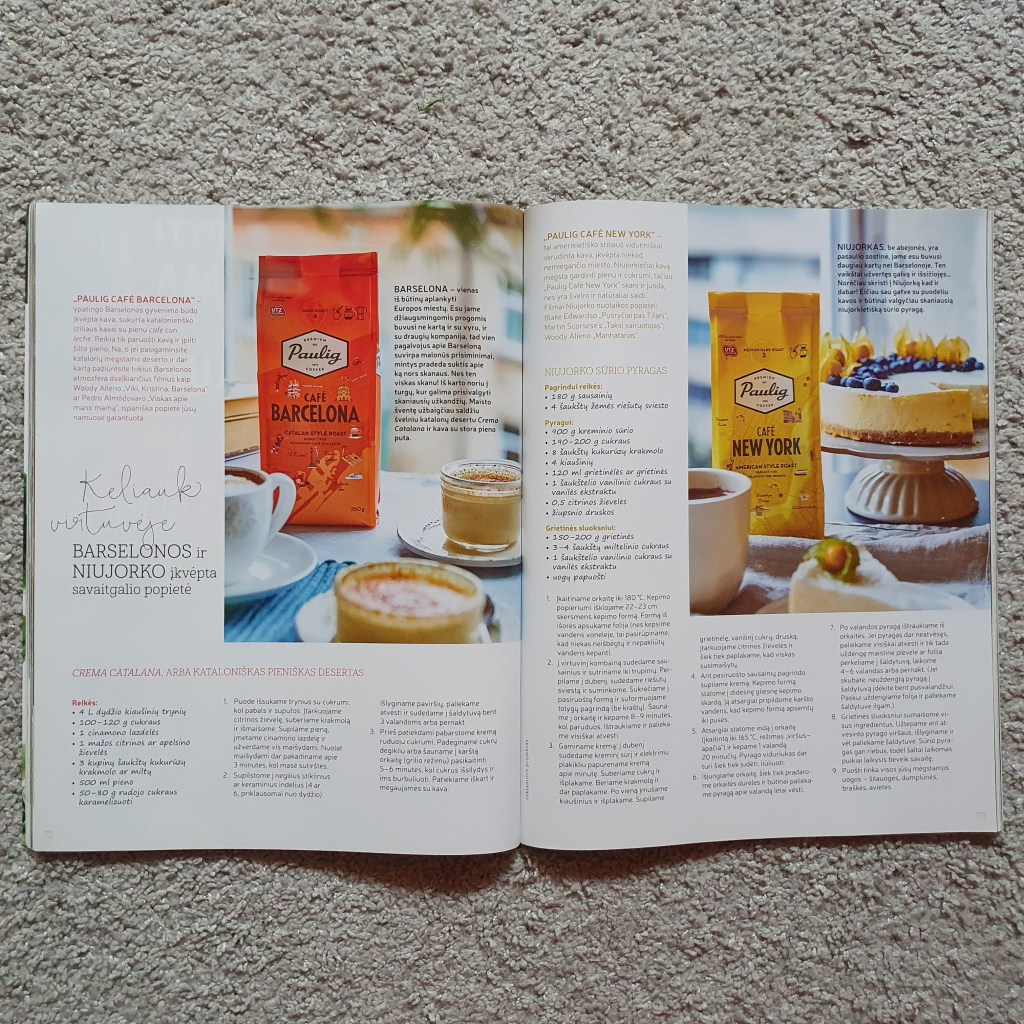
It is Lithuanian magazine released by Beatha Nicholson. I love her magazine because the layout is so organized and clean. No unnecessary text, and the view is not overcrowded by pictures, text, and colors.
The column width is 5.7cm, so the eye do not get lost in text and it is very handy for the cooking magazine where is plenty of recipes! The margins are great, right and left 1.5cm, top one 1.2cm and bottom one is 2.9cm.
The grid type is column one. As mentioned before, it is great for this type of magazine with recipes, easy to follow the text. In both pages the images remain in same position, as well as columns, there is only some decorative text on the left page, which gives some easy for the eye.
Woman’s Weekend. Magazine


One more Lithuanian magazine, released weekly and it is made as casual magazine with some interesting readings and articles. Nevertheless, this magazine at least for me is way too much overcrowded, too much text, too many images and really lacking of white space.
Column width is 5.9cm, margins are uneven and tight, 1.4cm on the top, 0.9cm on the bottom, 1.1cm right, and 0.9cm left. Seems like it was tried to put as much information and images into one page (and into the rest of the magazine). The grid type is a column but seems hierarchal because of the images. Anyway, it is overcrowded.

Leave a comment