Here back again with more exciting things I have learned and showing my practice in the new post.
Today’s task was to make a small 15x5cm advertisement for Bergen Jazznatt for a local newspaper. I enjoyed making it; as I expected, it wasn’t as easy as it looked. But even though I took great joy in playing with white space and the hierarchy of the text. Below You can see my work.
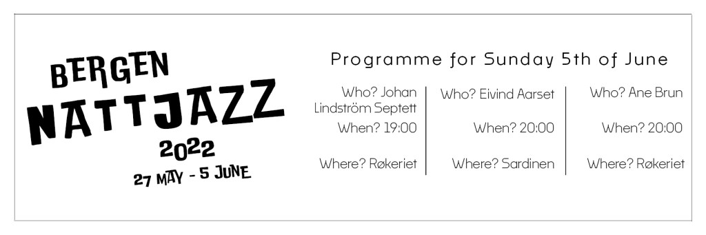
The main view first goes to Bergen Nattjazz 2022. The font I chose is funky and represents jazz itself. The program section is lighter and smaller, and artists, their performing time, and location are sectioned from each other to help simplify the advertisement for the viewer.

Leave a comment